Rethinking, redesigning & improving Thorchain website
-
THORChain ⚡ is revolutionary as it solves one of the major issues in crypto space. It allows to trade one digital asset on one chain with another digital asset on another chain in a frictionless, decentralized, trust-minimized way. There are no custodians. It also allows anyone to earn yield on their digital assets.
-
While the platform is phenomenal, the website and web-app look a bit bland. We believe, good user interface & user experience is needed for THORChain to achieve mass adoption.
“We wanted to give the landing a modern, future-esque look.”
We kept the website content the same as the existing one and changed the overall design. This bold new look would reflect THORChain’s unique solutions in a more visible way. 3D illustrations are all original.

Accessible, baseline color theme
Color is a great way to impart vitality, provide visual continuity, communicate status information, give feedback in response to user actions, and help people visualize data.
We created a color palette for this project from scratch while staying true to logo color. These colors can be used as-is, straight out of the proverbial box. The system colors look great individually and in combination, on both light and dark backgrounds, and in both light and dark appearances.
This includes default colors for:
- Primary and secondary colors
- Alert state colors for different severity levels
- Gray and Blue Gray scale for typography, and iconography
Accent Colors
Primary
#00A3FF
Secondary
#18E4CE
Error
#A71818
Danger
#E43D18
Warning
#E49F18
Info
#7218E4
Primary
Alert
Secondary
Alert
Error
Alert
Danger
Alert
Warning
Alert
Info
Alert
Gray
Blue Gray
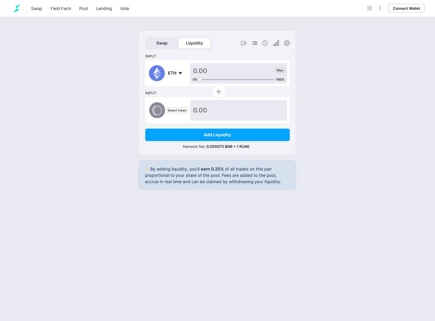
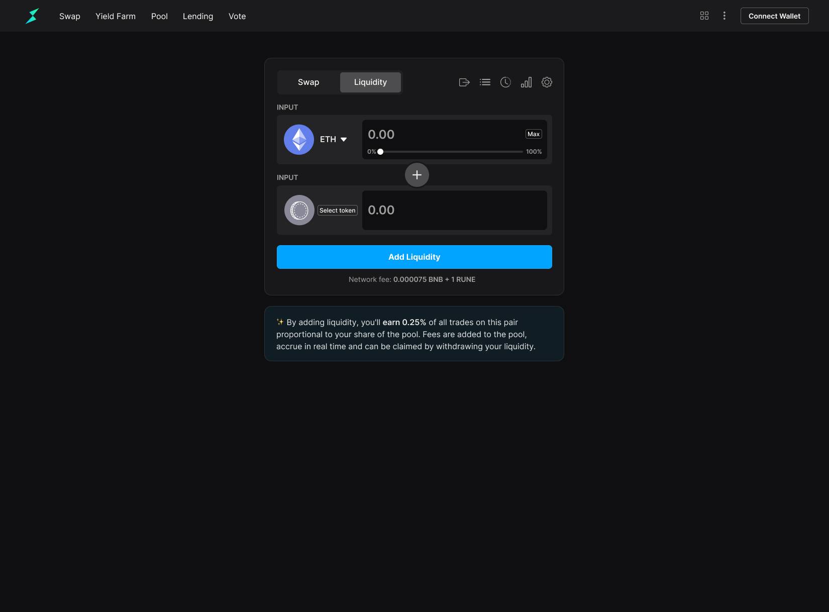
DeFi Web app
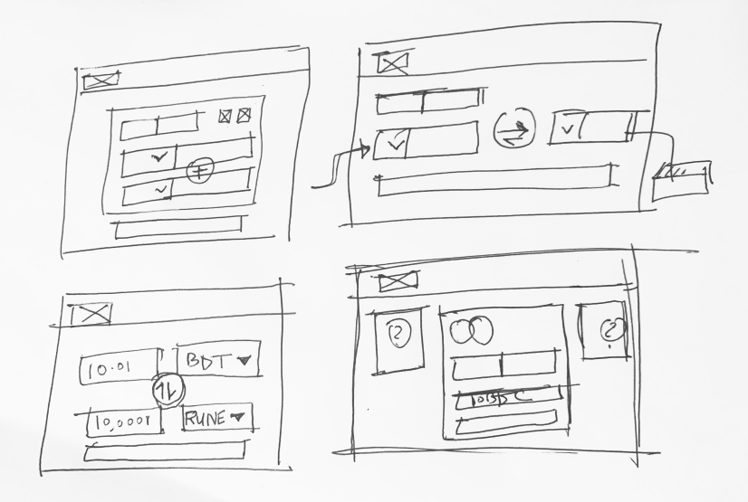
This was the most challenging part of the project. DeFi space is still early and existing UX solutions are not intuitive. My goal was to make the experience as instinctive as possible for a new user. The DeFi app should help you:
- Enable cross-chain swaps
- Earn 10% interest on a cash deposit
- Take out a crypto backed loan
Here’s some early wireframes for the project.
After countless iterations on wireframes, We finally started designing high-fidelity UI. The goal was to give users a better DeFi experience. Here’s the final version of some of the screens for web app. 😅


Dark mode
We developed a framework for dark theme as well. A dark mode displays dark surfaces across the majority of a UI. It's designed to be a supplemental mode to a default (or light) theme.
Dark themes reduce the luminance emitted by device screens, while still meeting minimum color contrast ratios. They help improve visual ergonomics by reducing eye strain, adjusting brightness to current lighting conditions, and facilitating screen use in dark environments – all while conserving battery power. Devices with OLED screens benefit from the ability to turn off black pixels at any time of day.